Tuesday, April 5, 2016

The Adventures of Penny - Final


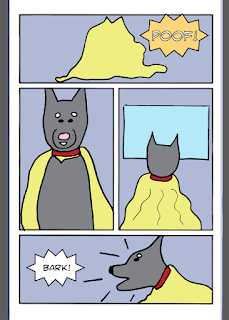
You will find my completed comic book titled "The Adventures of Penny" in the EPUB format (used for ebooks) at the following link: https://drive.google.com/open?id=0BxV48sBfXMm5SjBHREZmY3U2TUE

I had to upload it to Google Drive because for some reason I couldn't upload files to blogger (Still trying to figure this out. Seems kind of crazy that you can only upload images and video files. I have to be missing something!)

I made these files available to anyone with the link so there shouldn't be any issues with you viewing them in terms of privacy settings.


In case you can't few the EPUB, I uploaded a .PDF of The Adventures of Penny at the following link: https://drive.google.com/open?id=0BxV48sBfXMm5UkY1RlFXSExUSXc

This version is a bit compressed. I think my settings upon export from InDesign weren't quite right here.

I used the font called SMACK ATTACK BB from Blambot Comics.

Works Cited: 

"Blambot Comic Fonts & Lettering." Blambot Comic Fonts & Lettering. BlamBot, n.d. Web. 23 Apr. 2016.

Tuesday, March 29, 2016

M6 - Comic Book Part 3


Below are some screenshots of the work I've done in Illustrator so far. I was going for a very simple comic book, obviously. I am not a traditional artist so I wanted to make the drawing almost laughable. Have you ever heard of Poorly Drawn Lines? It is one of my favorite web comics. I drew a lot of inspiration from Reza Farazmand for this. Note, there may be some harsh language throughout this comic. So click at your own risk! :) 

There are a few little things I need to fix still but I am having a lot of trouble making the thought balloons on some of the panes cut off at the line of the comic itself. Hard to explain... Take a look at the second picture below (There are others that do this too...) the balloon extends the line of the comic's panel. I want to get rid of the part that spans the line. Everything I've tried to do so far hasn't worked. so if anyone has any suggestions, please let me know. I know I can just move them and make them smaller but I like the look of it when some of the balloons are cut off! 


A screenshot of how I made the thought bubbles. I created an oval using the ellipse tool and then many small circles around it. I then used the perspective selection tool to combine them all seamlessly and add a stroke to the final piece. 

Monday, March 21, 2016

M5 - Comic Book Sketches - Penny and the Blanket


My dog Penny is a mischievous Husky. She is always doing something to get her in trouble. She has an extreme love for all blankets, especially the ones on my bed. She loves to steal them, curl up on them, dive bomb on them when you try to get her off of it and she realizes what you are doing.... and most of all, tear them apart leaving only fluff and torn up pieces of blanket everywhere. It's honestly become a huge problem because I've had to buy a new blanket almost weekly. I now take the blanket and put it in a closet every time I leave. I wish I was kidding...

So I thought of this story where Penny uses the blanket as a cape and becomes a superhero, protecting our yard. Above is my sketch for the cover of the comic book and below are silly sketches of the elements within the book itself, such as other animals, a house, a car, penny, etc. They are SUPER rough. I'm honestly not that great of a traditional artist so I'm not that excited about this project but I decided to do the comic book because I took an animation course already and I thought this would be more useful, especially putting the pages together in InDesign which I want to learn anyway to create an ebook. :) I also sketched potential layouts of the book itself. 


Friday, March 11, 2016

Final - M4 Hand Drawn Lettering / Typography Competition


Guidelines: Digital Images: Must be RGB in JPG format with a maximum width of 1024 pixels and a maximum height of 768 pixels at 72 dpi. NO EXCEPTIONS. Digital images will be projected for the judges using an HD projector on a 6' x 4' screen.

Below you will find my new file with the correct guidelines for digital images as per the CA competition guidelines. 


For this project I re-drew out the text "we're all stories in the end" how I envisioned, with the banners and the contrasted type (all caps/lowercase and script/sans serif). I used my sketch as a guide for this and did my best. I do wish this part came out better. 

I scanned the paper at 600 DPI. My scanner can't go any higher. I would have liked to go to 1200. 
I took the image into Photoshop. I used levels and curves in Photoshop and removed all of the gray tones so that it was a true black and white and made the contrast very... high. I used layer masking to get rid of the dust on the paper and I hid the pixels of the paper so that only the text was visible. I dragged this from Photoshop into Illustrator after creating a new file. 

In illustrator I used the image trace option and then I expanded it to create the vector. I selected all of the letters, made them white and then selected the background and made it transparent, including all of the gaps in each letter, like the D, R, O, etc. I dragged on the watercolor background and then I selected the banners and made them purple with the dropper tool by selecting a color from the watercolor background.

The watercolor was a texture background I found here: 20+ High Quality Watercolor Backgrounds and Textures.  I would have liked to create my own water color but I do not have watercolor paints. I researched how to do it in photoshop a bit, it seemed I would need brushes. Anyone know another way? I found these brushes but I hated what I did with them. The terms and conditions of use were as follows: 

Photoshop Brushes by McBadshoes - http://mcbadshoes.deviantart.com/

My brushes are free to use for all art projects!  

*DO NOT distribute brushes without my permission!

*CREDIT and/or LINK ME when using brushes/images.


The above was my watercolor creation in photoshop with those brushes. I hate it! I could never get the real water color feel with them. I'm tempted to go out and buy some watercolor paints and some paper but in the interest of time, I don't think I'll be able to.  

I enjoyed the process of creating something on paper and turning it into a piece of digital art very much. I have always wanted to learn how that was done so that is why I decided to do this for my design competition. I could have taken the easy way out and done a photography competition since I am a photographer but I wanted to challenge myself so that I would actually learn something useful and be able to take it with me in my career... or as a hobby because this was REALLY fun. I do wish that I knew calligraphy and that I was able to smooth out my letters a bit more. The more I did it, the worse it seemed to look. I'm okay with how it turned out because I feel that it has a bit of a hand-drawn feel/charm. The biggest thing that I am happy with is that I finally know how to do this process and I feel pretty good about doing it again. 


M4 Sketches - Hand Lettering Competition


Above is the first mock up of the quote "We're all stories in the end" from Dr.Who. It is meaningful to me because as I stated in our discussion, my best friend passed away this January. She was 29 and loved Dr.Who. The quote also serves as a reminder of our fragile lives and mortality. 

I wanted to have a contrast of hand drawn lettering. The ALL and the IN THE are all caps in this version with slight serifs. I definitely don't like them. If I went this route, I'd need to do a lot of practicing. The words stories, end and we're are in a more cursive font and are upper and lower case to contrast with the block letters of the words all, in and the. 


One this page I have a bunch of sketches of different embellishments I could use throughout the hand lettering to draw attention to the quote. I'm not sure what you would call them all but there are about 6-7 different kinds. 

I used the flags and a cursive lettering for the words all, in and the. Again I used capital letters for we're, stories, end but I very much like these letters instead of the blockier ones above. Obviously I started the word stories too late and would move it over so it doesn't get smaller. The word end would also be moved down and under "in the" ... I ran out of page :)


I wanted to try one with the words all the same length which would require the smaller words "all" to be larger. You can see that variation in #5 on the right. I drew it slanted but it isn't supposed to be.

The one labeled number four I tried it with different embellishments and kept ONE flag. 


Tuesday, February 23, 2016

M3 Final Website


Home page/splash page - I wanted to highlight a few things with this. I wanted to highlight future courses I plan to design for the web as well as highlight free resources I'm creating and the eventual community that will hopefully happen naturally if I actually am able to effectively market myself and these offerings in the way that I hope to. I also wanted to still have a place to showcase my work. 

The photos are not all mine. I grabbed a few from a free stock website. The mug with the fire behind the word portfolio is something that I took. For a real site launch, I would obviously go out and take some new photos just to avoid any potential issues but I thought the stock photos would be fine in this case, as place holders. Plus they were free and 0 under creative commons, no attribution necessary. Now that I am typing this I have some I could probably replace already for the main photo. The photo with the words "Ready to take your photography game to the next level..." would be a rotating slider that would highlight other important things going on, maybe in person work shops or something else I want to offer/show my audience. 

The navigation bar uses type kit font - Bree. I created shapes in illustrator do to this. The social media icons used in the top nav bar and the footer are also from a stock site for icons. 


About Page - I used my current headshots for this page. I think when the new website launches I will change this around a bit to be less about ME and more about my mission and all of that. With a little bit about me at the end. I kept everything more of less the same as the home page navigation wise (footer and nav bars - top and sub) My H1 and H2 headings might be a bit different. I like the caps of them. For fonts I used Proxima Nova from type kit and Museo Slab - 300 from type kit. 


This is the course splash page. I wanted to highlight a few courses here. There are some plugins that would serve as a learning management system I could implement to help me but I am still researching them. The Light Writing course is cut off because that would be a scroll. I'm wondering if I should have left the footer off here and just continued listing classes until I got "to the fold." Obviously the footer would be the last thing seen on the page. I thought of a new class I wanted to develop the other day but I am now left trying to remember what I was thinking. I hate that I didn't write it down! 


Once you click on one of the "Learn More" buttons, this is the page that you would arrive at. It would give you a more in depth explanation as you scroll down of each module of the course and what you would learn. 

Stock photos -  Various sites requiring no attribution found here: https://stocksnap.io/
Web Icons - found here: http://icons.webtoolhub.com

I left my "logo" kind of boring on purpose. I already have one for my portfolio site but I'm not 100% sure if I would keep this site as MY NAME or rename it. Some more interesting type would be beneficial here but I was more concerned with the navigational elements and page layout for this project. 

I used illustrator for this and I saved the files as .ai files but when I saved them as .jpg they got a bit blurry. Anyone know best practices for this? What did I do wrong? Thanks for your feedback and input in advance :)